You’re starting something and want it to look settled from the first day — one mark and one look that hold together on your site, your social pages, and everything you hand a customer.
Service
Brand & Logo
Marks and wordmarks with a reason behind them. A logo is designed, tested small enough for a browser tab and large enough for a sign, and delivered as a small brand kit — colors, type, and files for web, social, and print — so the look holds together everywhere it appears.

What’s Included
The full breakdown
A mark with a reason
Every logo starts from what the business is — the shape has to carry the idea, not just fill a space.
A wordmark to match
The name set in type chosen for it — weight and spacing worked out by hand, never left on default.
Colors and type, written down
A small brand kit sets out the colors, the type, and how they go together, so the look stays consistent.
Light and dark versions
Every mark is prepared for both — it reads as clearly on a dark screen as it does on a light one.
Tested at every size
Checked small enough for a browser tab and large enough for a sign before it is handed over.
Files for web, social, and print
Print-ready files are part of the kit — the mark stays sharp on a screen, a shirt, or a sign.
Good Fit
Who this is for
Proof
See it in the work
Brand & Logo
Kernel Studio
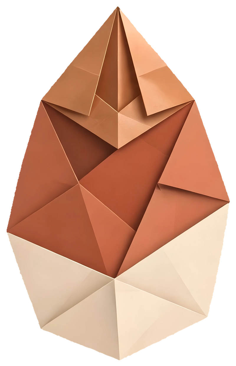
The studio’s own mark — a seed folded from copper, terracotta, and cream paper, drawn to work at any size.
Brand & Logo
True Carpentry
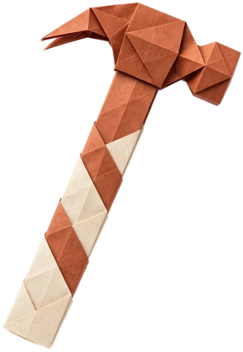
A monogram crest for a Georgia carpentry company — carried across its site, from the header to a watermark on the inner pages.
Let’s build something
A new website, an app, or a fresh look for an old one — tell us about the project and we’ll take it from there.
Start a project →